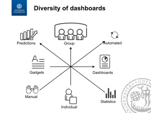
Dashboards and all kinds of radiators are very popular in industry now. They allow the companies to disseminate the metrics information and to find the right way of visualizing the metrics.
In a recent article written together with Ericsson and Volvo Cars we have explored how to find the right visualization and we developed a model for choosing the dashboard – http://gup.ub.gu.se/records/fulltext/220504/220504.pdf.
The method quantified a number of dimensions of a good dashboard and provides a simple set of sliders that can be used to select the right visualization. The companies in the study have found it to be a good input to the understanding of what the stakeholders want when they say “dashboard”.
In the next steps we’re currently working on defining a quality model of KPIs – Key Performance Indicators. The first version has shown that it allows the companies to reduce the number of indicators by as much as 90% by finding the ones which are not of good quality.

